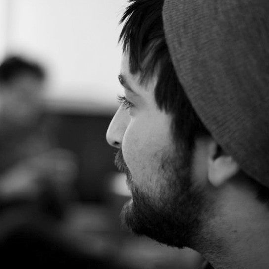
Thomas Jockin
Typographer Thomas Jockin loved to draw and paint as a child. “The first thing I can remember are illustrations of Mega Man X bosses. I’m taking about hundreds of pages of different characters with statistics, powers, and alliances! I believe I was around eight years old.”
In high school, he was introduced to the work of designer David Carson. “I loved the way he treated typography as a kind of painting.” Thomas attended Parsons School of Design for (Communication Design) and in his sophomore year, had Joshua Darden as his typography professor. “It so happened he was hired that year and this was his very first class. I loved the way Joshua thought, the way he approached things, his perspective. At the end of the semester, Thomas began working as Darden’s apprentice. “After I graduated from Parsons, we agreed it was time for me to start developing my own practice as a typeface designer. So, I left. But deep down I felt like an impostor — that I had nothing unique to present to the world. For the next three years, I freelanced, using my typography, lettering, and typeface design skills where I could, but never published a finished typeface family.”
“It took the right inspirations and mentors
for my life to take the shape it has taken.”
Taking the plunge
To get over my fear of not being ready, I decided to apply to the KABK typeface design program in the Hague. Then I met Jessica Hische at a Type Directors Club lecture. She told me about a post-graduate program in typeface design starting at Cooper Union. The deadline was the following week, and I barely made it. A couple of weeks later I found out I was accepted into the inaugural year of Type@Cooper. From that point on, my career has been nothing but fantastic. After I graduated, I published my first family, got commissioned for typefaces by clients, and got invited to give lectures about my work.
Creating Garçon Grotesque was an important step in Thomas’ career. “That’s when I got rid of all the anxiety and hesitation, and acknowledged to myself that I have what it takes to be a typeface designer. My childhood friends and family all believe that I always knew what I wanted to do, but that’s not the case at all. It took the right inspirations and mentors for my life to take the shapeit has taken.”
The importance of being open
Joshua Darden is definitely Thomas’ strongest design influence. “He taught me the importance of seeing. We make to see reality a bit clearer and, in turn, what we see compels us to make.”
Another influence, Arabic calligraphy, is evident in his work. “It’s so beautiful. Whenever I get bored with a project or reach an impasse, I use broad-nib calligraphy exercises. I start writing and, within a few minutes, I can move forward.”
Most creatives who work with clients love it because they love solving problems. It’s certainly true for Thomas. “A lot of my projects come from questions I’m trying to answer. Why does Copperplate Gothic look so bad, yet I see it everywhere? How does the broad-nib pen work? I love working with clients for this reason. They come to me with a problem or an issue, and my mind is forced to look into topics, genres, and eras that I wouldn’t naturally go.”