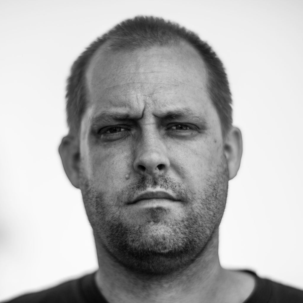
Corey Holms
Corey Holms is an identity, entertainment, and type designer. He designed his first typeface while studying at the California Institute of the Arts. “I was very much interested in non-standard typography, and since the school wouldn’t buy any typefaces, we were required to make or modify them ourselves.”
He created his first commercial typeface in 1996 for a vintage boutique in Los Angeles. Interestingly, other than the ones he made in college, every single typeface Corey has designed came from a rejected logo. He explains, “I often create new letterforms when designing a logo, to give the project its own feel. Sometimes these really stick with me, and even though the logo isn’t used by a client, I just can’t let them go, so I turn them into full typefaces. Some of them take years to come to fruition. I started one of my current projects over 15 years ago, and I‘m still struggling to make it turn out the way I envision it.”
Corey designed the movie posters
for Where the Wild Things Are,
Lost in Translation, Watchmen,
and The Sixth Sense.
On some of his favorite projects
You may not know his name, but you’ve definitely seen Corey’s work. He designed the logo for The Sopranos and movie posters for Where the Wild Things Are, Lost in Translation, Watchmen, and The Sixth Sense, among many others.
One of his favorites is a recent collaboration with a Swedish director for a film titledThe Sarnos. He says their “similar tastes made the type of work I do blend perfectly with his artistic aspiration. I was able to distill his work down to basics and portray exactly what he wanted.”
Another memorable project was the creation of “a piece for a limited-edition Depeche Mode box set for their album Sounds of the Universe. They were my favorite band for a large portion of my life, and I still can‘t believe I had the chance to make something for them. And I got to collaborate with my wife — she did the embroidery for one of my designs, which I then photographed for the final piece.”
And his design for 23&Me was “one of the more mature and well-thought-out logos I have created. Not only is it a strong-looking logo, but it‘s a malleable logo that has multiple iterations in layout and color — something that I feel gives it a great sense of modernity.”
On what compels him to create
Corey’s compulsion to create is, he thinks, “very likely a chemical imbalance. I was tested as a child and found that neither lobe of my brain is dominant, so I tend toward both the artistic and analytic. I don‘t create art in a vacuum, but give me some parameters and I’m off and running. Having ADHD, I shift from one thought to another pretty regularly, so ideas come in floods or droughts.”
Although he does different kinds of design, Corey gets “the same pleasure from doing a poster or a typeface as I do from a logo or a photograph. The only difference is that I like to work quickly in bursts and on different projects, so I tend to move from one to another regularly, and enjoy being at a point in my career where I have many different types of work going on all the time.”
Like most makers, he‘s always creating. “From the moment I wake up to the moment I go to bed, I am working. Sometimes the work is for myself and sometimes it‘s for clients, but all of it melds together as I shift back and forth between projects, so things created for one often become germs of ideas for another.”